Editorial Case Study
Casa Fares Editorial Layout
Editorial design developed through structured page rhythm, typography, image hierarchy, and refined publication composition.
Role
Editorial Designer
Layout design, typography, visual hierarchy, and publication composition.
Scope
Editorial Feature
Magazine spreads, page sequencing, content structure, and visual storytelling.
Focus
Publication Rhythm
Creating a clear reading flow through spacing, photography, type scale, and page-to-page continuity.
Project Overview
A refined editorial system built around visual pacing and structured storytelling.
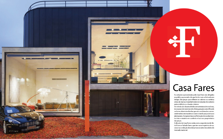
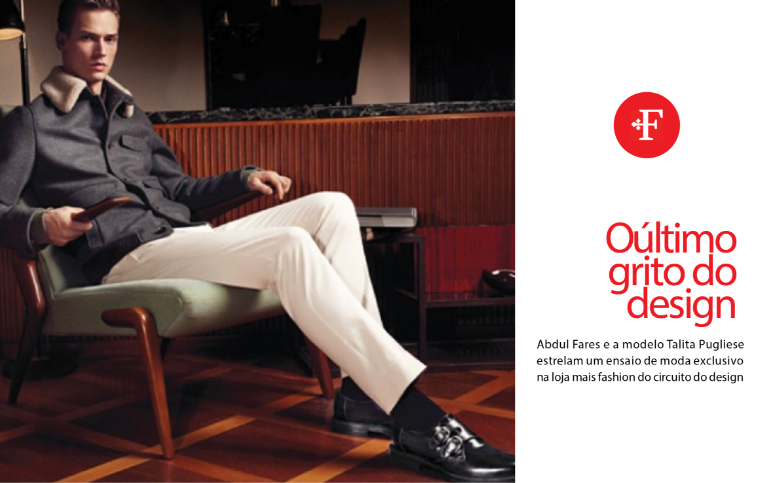
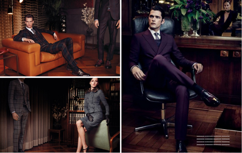
The Casa Fares project focused on creating an elegant editorial experience where image placement, typography, and page structure work together to guide the reader through the content.
The layouts balance clean composition, white space, and visual hierarchy to create a publication flow that feels organized, polished, and immersive.


Design Direction
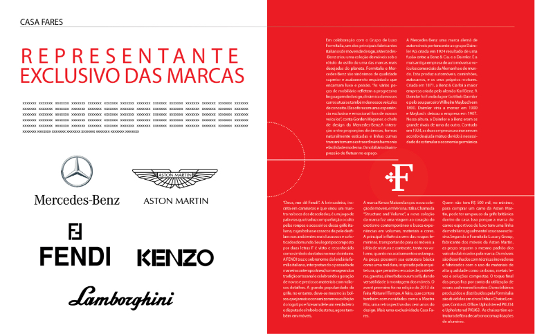
Image-led storytelling supported by typography, spacing, and editorial structure.
The design direction emphasized elegant pacing, balanced spreads, and a clear relationship between photography and written content.
Back to Editorial